Hyvo Analytics Explained: How to Measure Social Media Performance
What each screen shows, why the numbers differ between networks, and why everything is stated against your own median instead of an industry average.

Quick guide
Analytics compares your posts against your own median rather than an industry benchmark, and shows the sample size so you know what to trust. Networks report different numbers, so some accounts have a reach figure and some do not.
- Start at the summary cards for the four headline numbers and their change.
- Use the chart to see the trend rather than a single week.
- Use What Works Here to see which formats beat your own median.
- Read the sample size line before you change anything.
- Ask Hyvo AI if you would rather have the answer than the screens.
The full walkthrough is below.
Most analytics screens are a wall of numbers with no opinion about which of them matter. This one has an opinion, and it is worth knowing what it is before you read anything.
Two rules run through the whole thing. Everything is compared against your own history rather than an industry average. And the sample size sits next to the finding rather than in a tooltip, because a pattern from eight posts and a pattern from two hundred look identical on a bar chart.
The summary cards

Four headline numbers with their movement. This is the glance, not the analysis. A green arrow here is a prompt to go and find out why, not a conclusion.
Reach sits on its own card where the networks report it.

Why some accounts have no reach figure
This confuses people, so here it is plainly. Networks decide what they hand back to a tool like this, and they do not agree:
| Network | Reach figure | Responses reported |
|---|---|---|
| X | Impressions | Likes, replies, reposts, quotes, bookmarks, clicks |
| TikTok | Views | Likes, comments, shares |
| Threads | Views | Likes, replies, reposts, quotes |
| Impressions | Saves, outbound clicks | |
| None | Reactions, comments | |
| None | Reactions, comments, shares | |
| None | Likes, comments | |
| Bluesky | None | Likes, replies, reposts, quotes |
| Mastodon | None | Favourites, replies, boosts |
So an engagement rate on X is responses divided by a real denominator. On LinkedIn there is no denominator, and any tool showing you a LinkedIn reach number is estimating it. Hyvo would rather show fewer numbers than invented ones.
The engagement chart
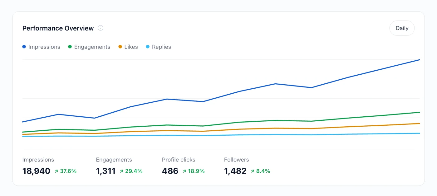
The trend is the part worth reading. A single strong week is usually one post, and one post is usually luck. Four weeks pointing the same direction is a change in what you are doing.
What Works Here
This is the screen that answers the question people actually have.
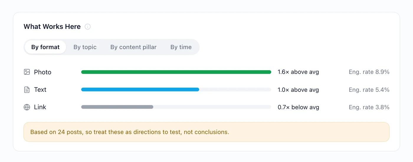
It groups your posts by format, topic, pillar or time, and shows how each group did against your own median. "Photo posts run 1.6 times your average" is a claim you can act on. "The average engagement rate on LinkedIn is 2%" is not, because that average is drawn from accounts nothing like yours.
Underneath every finding is the sample. Twenty four posts is a direction to test. Two hundred is closer to a rule.
Top posts and best times
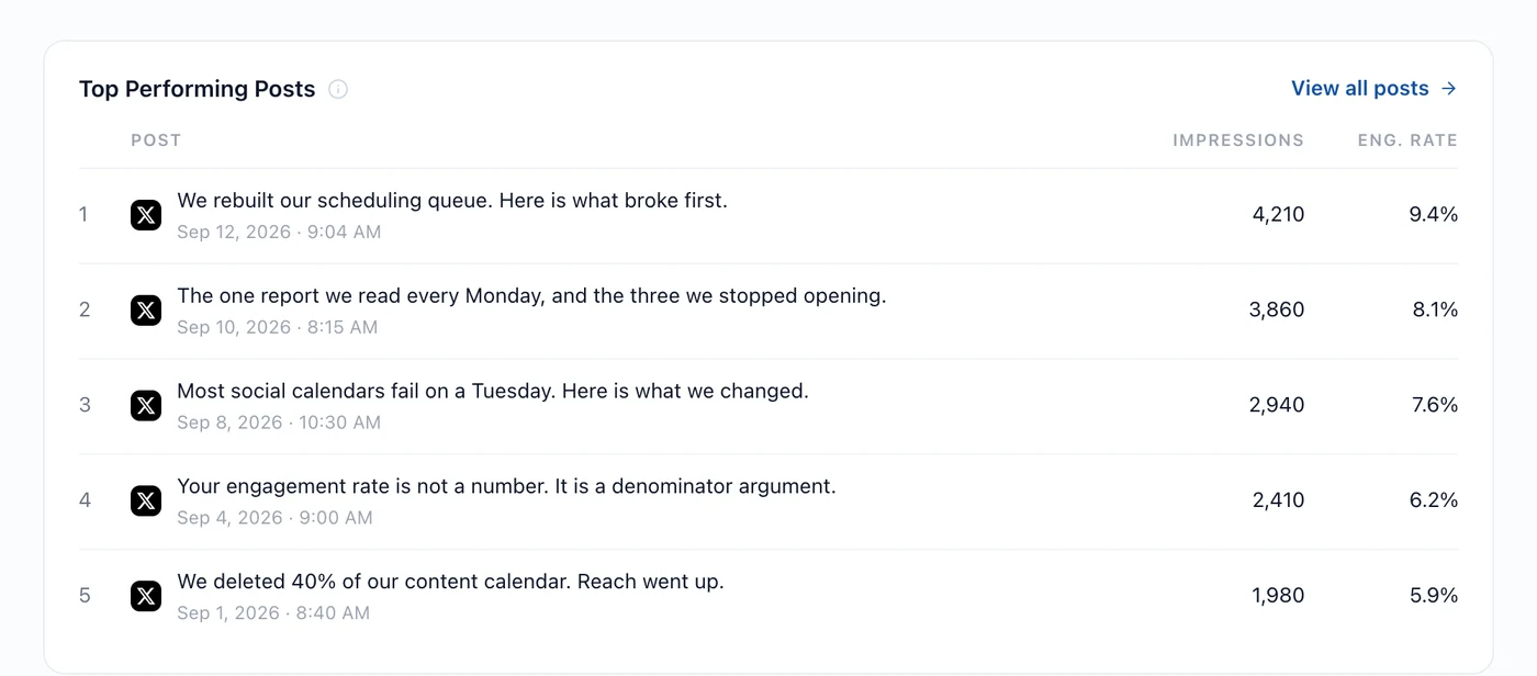
The ranked list is the raw material. The pattern behind it is the useful part, which is what finding your best performing content is about.
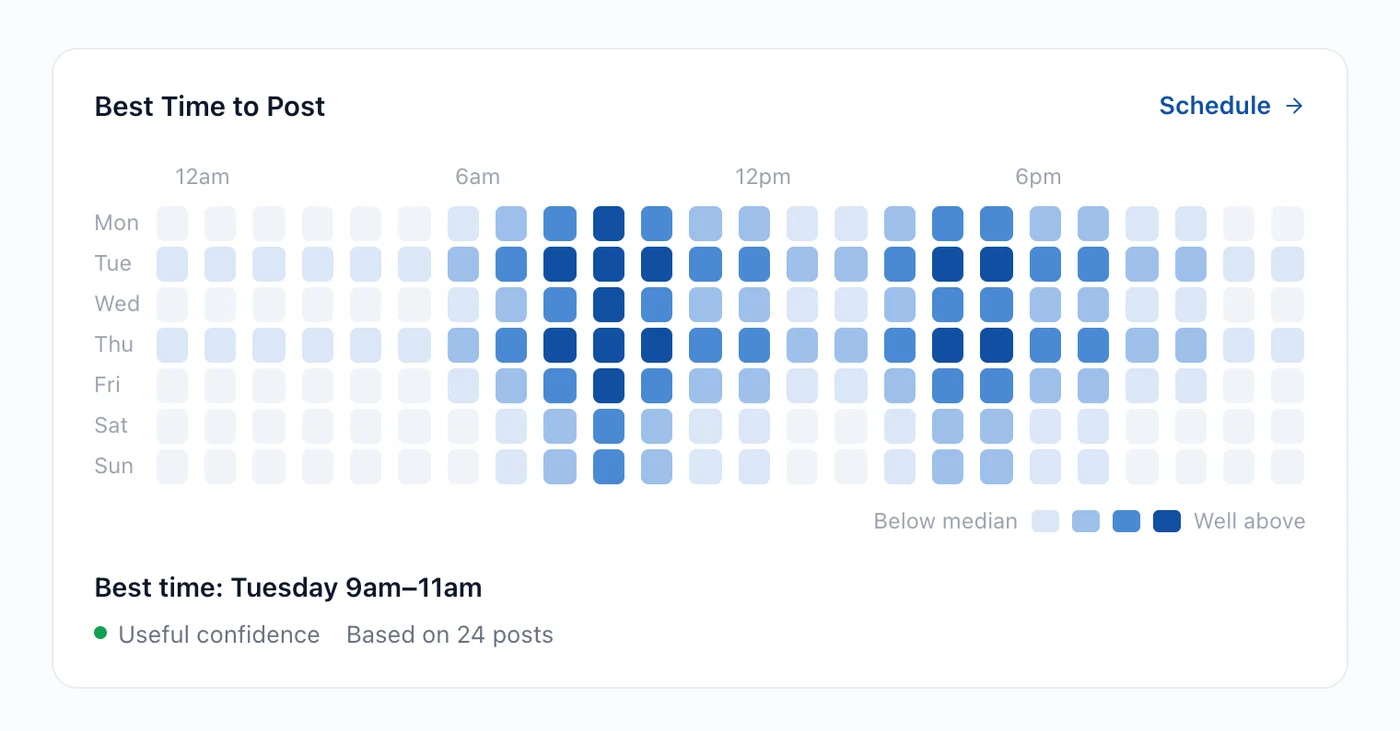
Best times come from when your posts actually did well, not from a published study. Which also means they are only as good as your history: if you have always posted at nine, the data cannot tell you about four.
Ask Hyvo AI instead
Every screen here has a question behind it, and you can skip to the question.

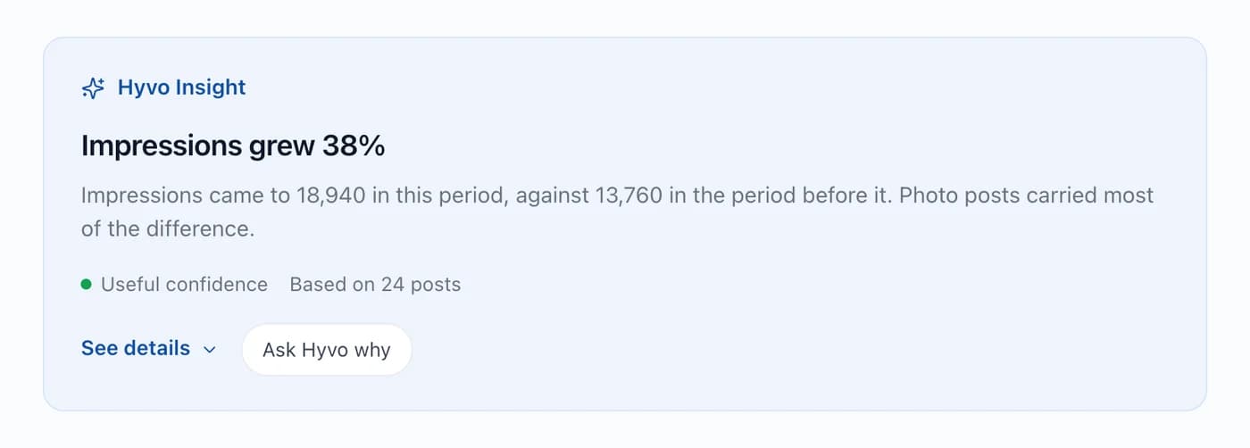
Hyvo AI reads the same data these screens do, so "which of my posts beat my median last month and what do they have in common" gets you the ranking and the pattern in one answer, with the confidence stated.
What analytics cannot tell you
Two limits worth holding onto.
The record starts when you connect. Most networks do not hand a third party tool your past posts and their engagement. So a LinkedIn Page you have run for two years arrives with an empty history and fills up from the day you connect it.
Correlation is all you get. Analytics can tell you that photo posts do better for you. It cannot tell you whether that is the photo, or the fact that you only make photo posts for your best ideas.
FAQs
Why does Hyvo compare against my median instead of an industry benchmark?
Because published benchmarks average across account sizes, audiences and posting rates that have nothing to do with yours. Your own median is the only baseline that means something for your account.
Why is there no reach number for my LinkedIn page?
LinkedIn does not report one through this connection. Hyvo shows the reactions and comments it does receive rather than estimating a number it cannot get.
How many posts before analytics is useful?
Roughly twenty before patterns are worth reading, and the screens tell you the sample size so you can judge for yourself.
Does my history from before I connected show up?
No. Networks do not open past posts to third party tools, so the record starts at connection.
Can I get a report out of this?
Yes. Ask Hyvo AI for one, or build an automation that produces it on a schedule.
About the author

Founder, Hyvo
Subarna Basnet is the founder of Hyvo, an AI-powered platform helping businesses create, manage, and automate social media marketing. He writes about AI, social media automation, content creation, and marketing technology.